
Lynn Shepherd on... Judging a book by its cover
People are fascinated about the process of choosing a jacket, and how much influence an author has in the look of their book. The first thing to say at this point is that unless you’re a very famous – and therefore a very powerful – writer you get very little actual say in your covers. The standard publishing contract requires your publisher to consult with you about the proposed design, but there’s nothing to compel them to take your thoughts into account. Clearly they won’t want to put out your book with a jacket you loathe if they can possibly help it, but at the end of the day it’s down to them. And if you think about it that’s exactly how it should be. Your publisher knows the book-buying market, and they’re the ones who can position the look of the book to appeal to the maximum number of readers. This is especially important for overseas countries (in my case places like the US or Australia), because those are markets you won’t know, where you’ll rely even more on the judgment of your publishers.
The covers for my first book, Murder at Mansfield Park, are an interesting case in point.
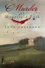 This is the original UK paperback, which is based on a 19th century painting. Visually this is basically a combination of a ‘Penguin classics’ sort of look, with a rather shocking splash of blood across the top. A cover that does exactly what the book does, in other words, and leads you to expect a story that brings together the grim reality of murder, and the genteel Regency world of Miss Jane Austen.
Here’s the North American version, which cleverly picks up some of the design elements of the UK one (the house, the man and the dog) but sets them in a darker, almost theatrical setting. Very American Gothic. This is the Australian one. Completely different in feel, and decidedly tongue-in-cheek. Makes you think the book inside will be both playful and funny (which I hope it is). That strapline – ‘Someone’s been messing with Fanny’ – had me laughing out loud when I first saw it.
The Spanish translation is different again. These designs were specially commissioned for the book and it’s intriguing that this is the first and only cover to give us a close-up human face. And what a face! The look combines a period feel with a very modern and witty archness. And finally the recently-issued UK e-book. This is the first to use a photographic landscape, and there’s a definite sense of foreboding in the brooding sky, the crows, and the decaying splendour of the overgrown gate.
So far I have two different designs for the new book – published as Tom-All-Alone’s in the UK, and The Solitary House in the US. And the jackets are every bit as different as the titles.
I confess at once that I utterly adore the UK design. Tom-All-Alone’s is the name of the rat-infested graveyard in Bleak House, which I took as the inspiration for my own Victorian murder mystery, and I suppose I always thought the graveyard would appear on the cover in some way. The genius of this particular design is that it deliberately isn’t trying to ‘look like Dickens’, any more than I have tried to write like him. The abstract design of the gates is clearly modern while evoking the atmosphere of Victorian London. So while it echoes Dickens’ time, there’s no way any book by Dickens would ever have a cover like this – either then or now. And the black and white and silver colour scheme makes a huge visual impact. The US cover is much softer, and in some ways more enigmatic. There’s more of a story implied in the half-open gate and misty low light, and the pack of handwritten letters that are ‘bound about’ the book. It’s quite different in feel from the UK design, but very beautiful and just as eye-catching, and I love it just as much.
So the question is, which one do you prefer?
Tom-All-Alone’s is published by Corsair, and The Solitary House will be issued in May in North America by Random House. Her website is www.lynn-shepherd.com, which includes a short video about the book. You can follow her on Twitter @Lynn_Shepherd


Interesting post! I think covers are very important for books and especially for indie authors. Paying extra attention to the cover will surely help sales.
ReplyDeleteVery difficult to pick a favourite - they all have beautiful features. The North American version of Murder at Mansfield Park is jumping out at me but, to be honest, all the covers are intriguing enough for me to at least pick them up in a bookshop!
ReplyDeleteI like the e-book rendition of Murder at Mansfield Park. Not only is it a bit atmospheric and foreboding but a visual pun as well - for a group of crows are called a murder after all.....
ReplyDeleteOut of the 2 last covers I definitely prefer the cover and title of the UK version - its great.
ReplyDeleteI knew that countries have a different cover for one book but it is very interesting to see one book and all its different covers. My favourite is the first one, the Uk version. The australian one i find very weird for this book.
ReplyDelete